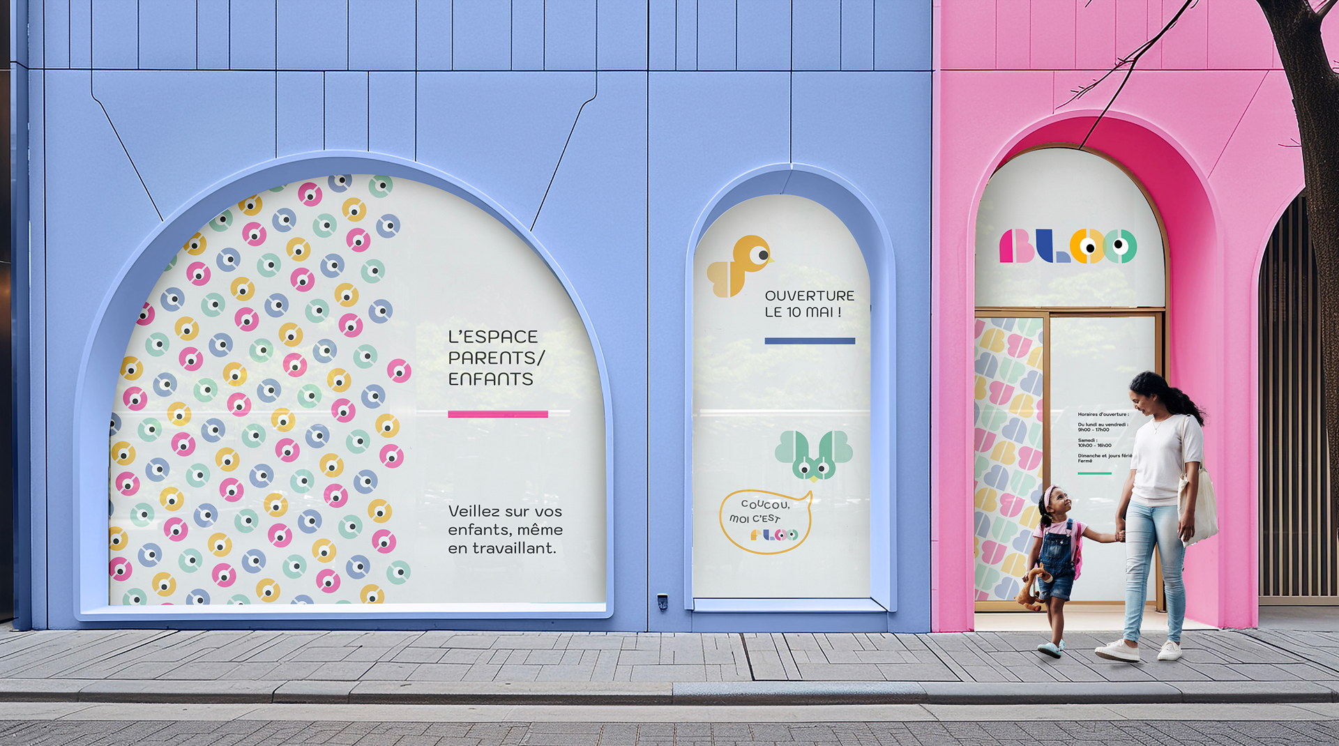


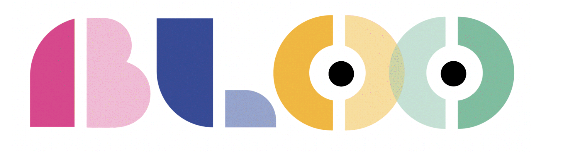
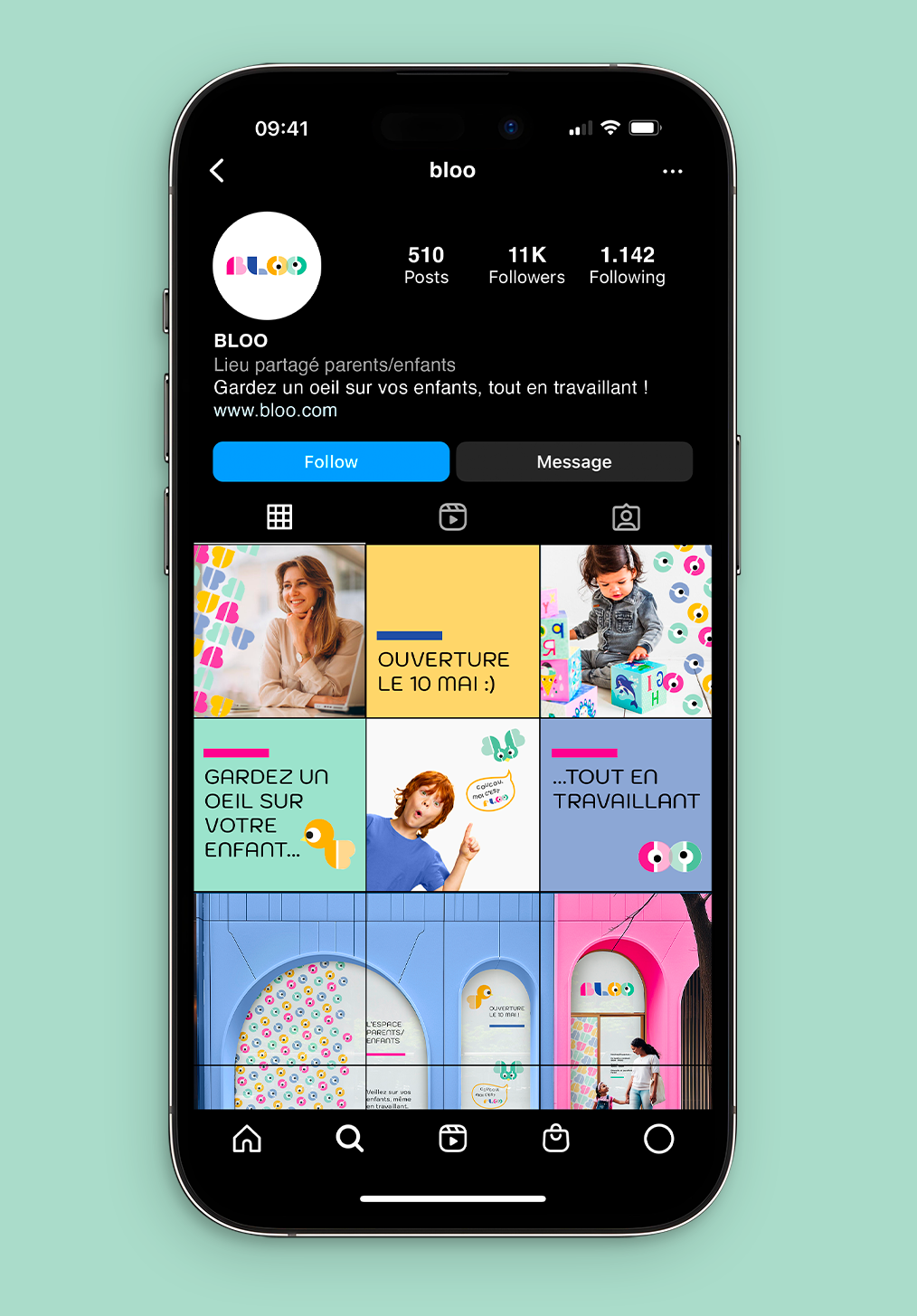
BLOO, Keep an eye on your child while you are working_
Creation of a brand unit for a co-working space that also welcomes children.
The playful typography, inspired by children's games, will include an ‘O’ personified as an eye to make it easy for children to identify with the logo and the space.
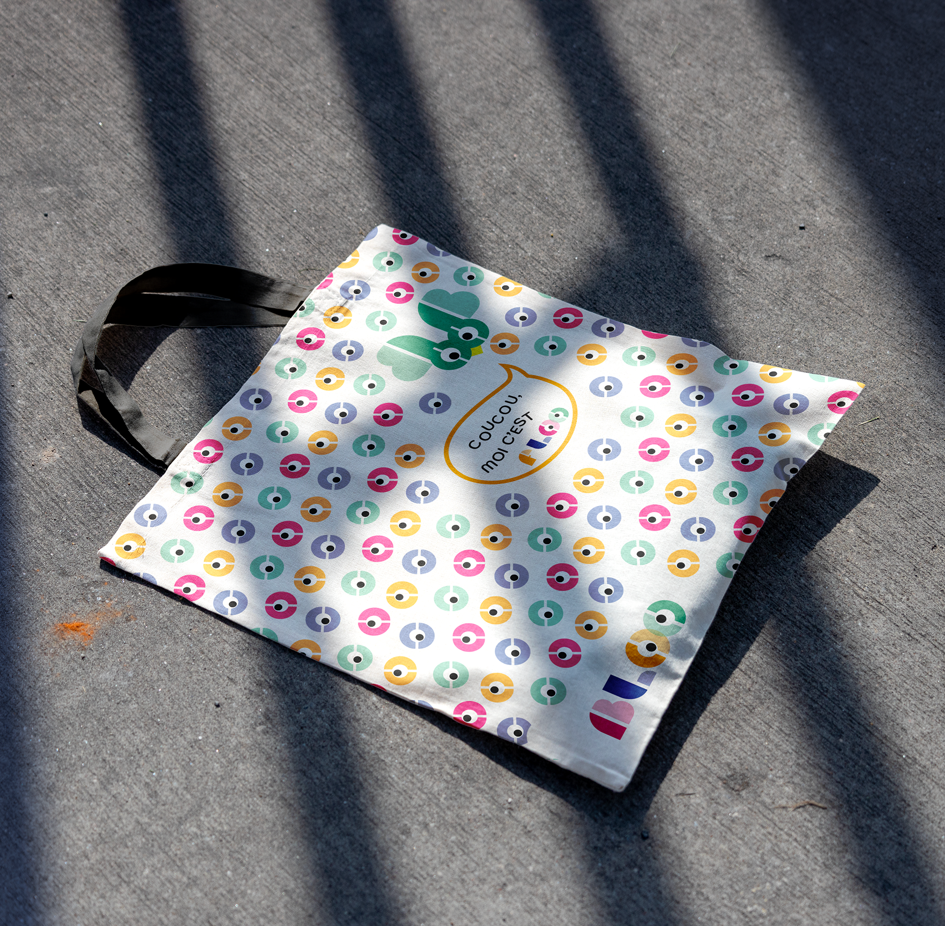
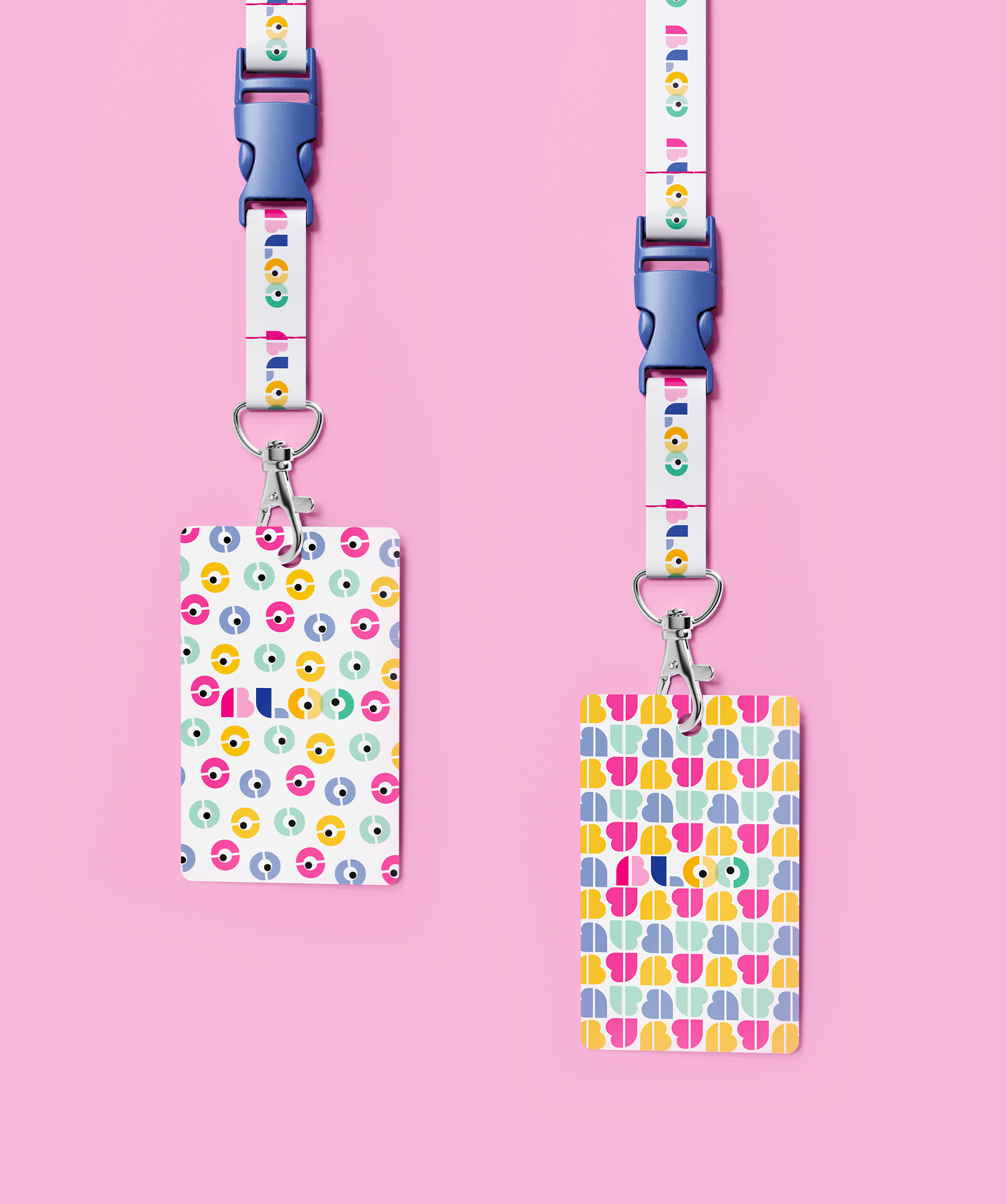
The aim is to create a reassuring and caring environment for parents and children alike. The mascots, mirroring the shapes of the logo, will add a playful touch and help children to find their way around the space. Finally, the two distinct motifs will help to communicate and guide both children and parents.
The playful typography, inspired by children's games, will include an ‘O’ personified as an eye to make it easy for children to identify with the logo and the space.
The aim is to create a reassuring and caring environment for parents and children alike. The mascots, mirroring the shapes of the logo, will add a playful touch and help children to find their way around the space. Finally, the two distinct motifs will help to communicate and guide both children and parents.
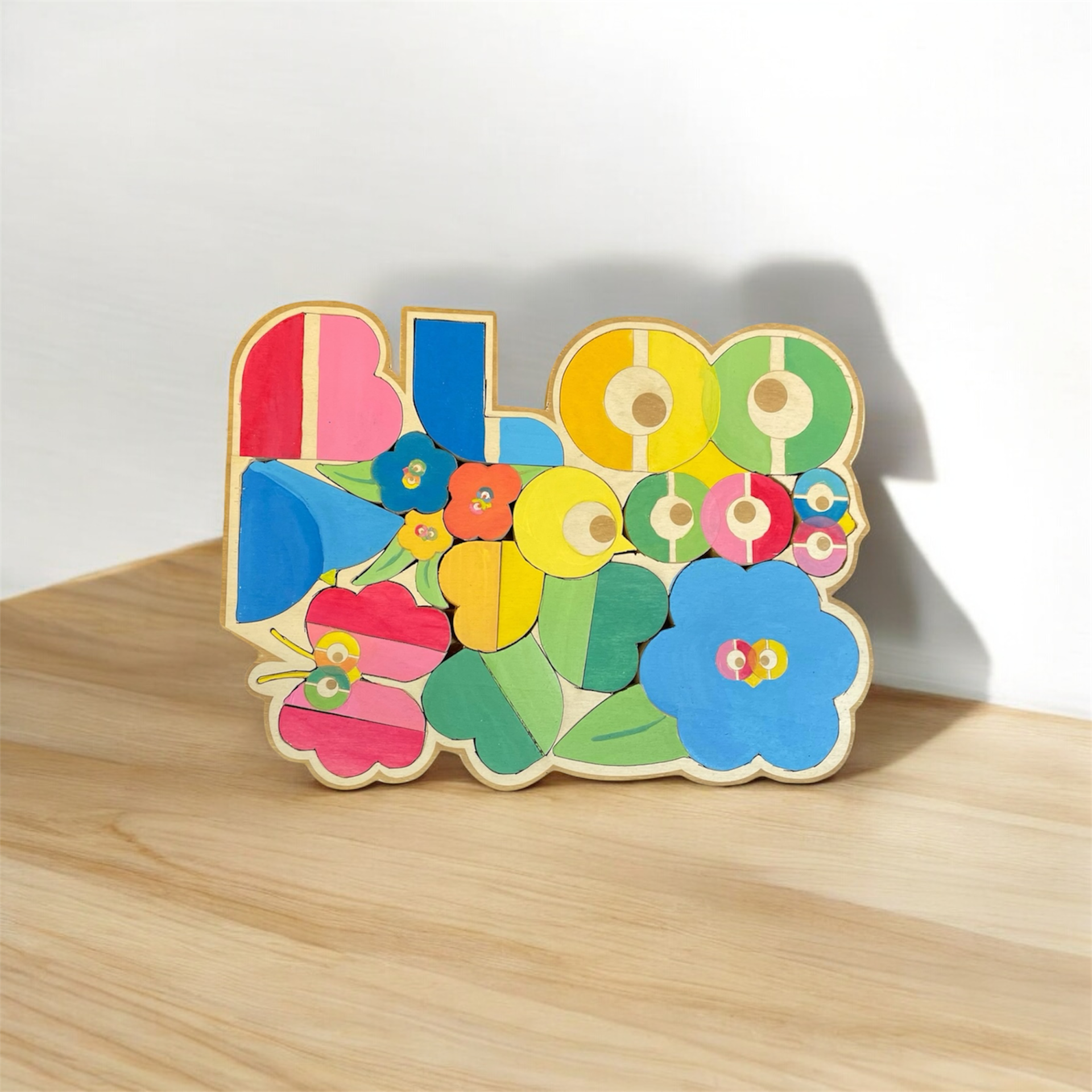
BLOO Puzzle_
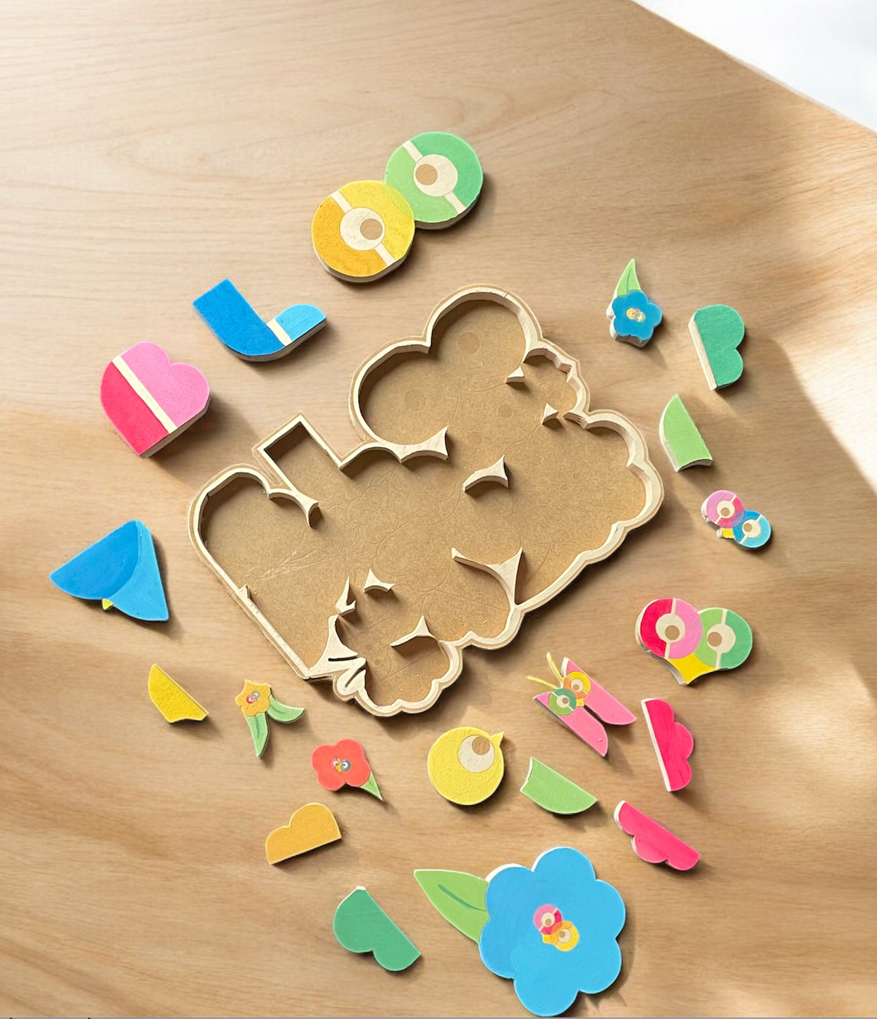
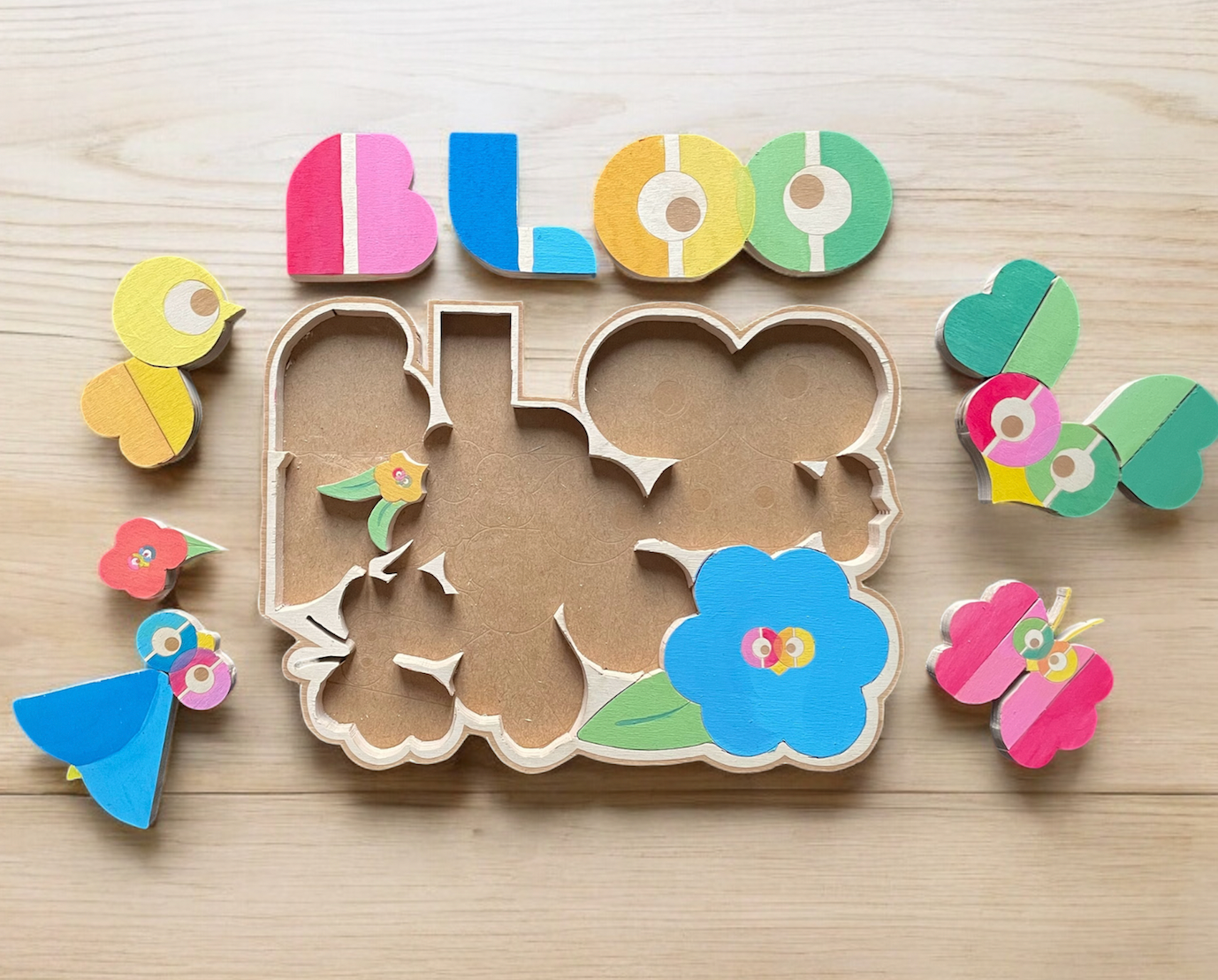
Puzzle created as part of an open design course, using Enzo Mari's concept of wooden puzzles with a low rate of material loss. The interlocking shapes reflect BLOO's identity, creating a game for children. The game highlights the creation of animals using typography. The shapes of the letters were broken down and reused to form birds, butterflies and many others.
The puzzle was made entirely by hand from 5mm A3 plywood. It was then carefully cut with a band saw, sanded and painted.
The board is lightly engraved to help children find the order of the pieces in case of difficulty.
Instructions are also available for finding the open source file so that you can make this object yourself.